Family Photo Restoration
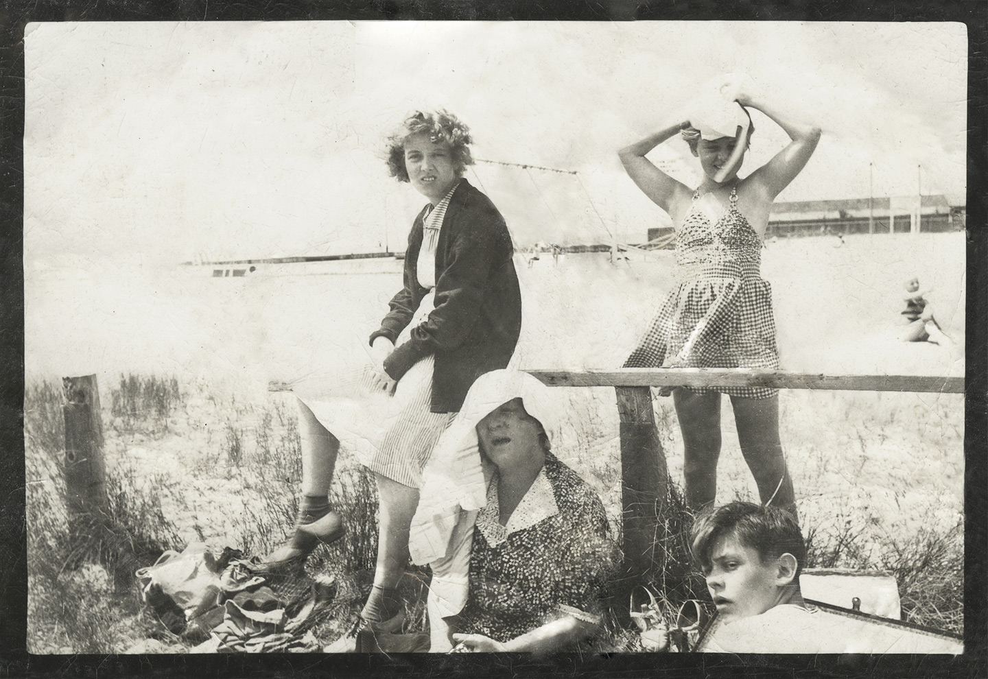
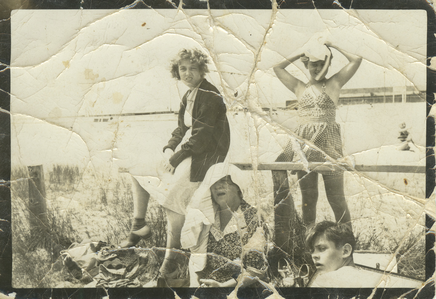
My partner brought a little present home for me from her mother’s house. Less a present really, more of an assignment. Her mother had found this picture of HER mother and sister and grandmother in some drawer or other. It had been battered and beaten and probably put through the wash a few times, but they wanted to see what I could do with it.
Step one was to scan it in order to get as much information as possible out of the original. Pulled my old Epson flatbed out of the closet and plugged it in, fired right up. Scanned it to a TIFF file at 1200dpi. Not that there was anything near that much information in the print, but I find that when doing restorations like this, the higher resolution let’s you more easily discern between the image and any physical flaws that have befallen the print. If you don’t have a scanner, you can also take a well exposed picture with your camera and start with that. Just make sure you light it from the side so you don’t get reflections in the image.
Most of this kind of work can be done in Photoshop using things like the spot-healing brush and stamp tools. Certainly when it comes to creases across a largely white sky those techniques work pretty flawlessly. The problems come when you need to invent information. The places on the print where the image has been torn away for example, that’s information I have no way of getting back. For things like the pattern in their dresses, you can use the healing tools to mimic or clone in the pattern from elsewhere to good effect. Other areas like the swing set to the right of the central girl, I can’t accurately recreate that. Best I can do, within reason, is to use the surrounding image to guess, and that’s just what I did.
Overall not bad considering I only spent an hour or so on it. Is there room for more work? Sure, but you’re quickly approaching the limits of your return on time invested. We want to save and perhaps restore the memory a bit, no need to go all Ken Burns.
I also could have increased the contrast even more and desaturated the whole thing entirely. That would probably deliver an image that was much closer to how the print looked in the 1930’s, but also kind of loses some of the Age that the print has imbued on the memory. So in the end I pulled back the contrast and desaturation layers to let it feel a bit more like the original.
Either way it’s a good ‘waiting for the snowstorm’ project, and a great way to get your feet wet in PhotoShop. You’ll learn how to use layers and healing/clone tools, as well as adjustment layers and color. I highly recommend you get a tablet to do work like this. Trying to do this with just a mouse would be like doing a fine pencil drawing while wearing ski gloves. The less expensive Wacom tablets are a great deal, and a good place to dip your toe in the water.
So go rummage through some drawers and give it a shot. Your children and your children’s children will thank you some day.
Contact Sheet Poster: An Alternative to Vacation Photo Prints
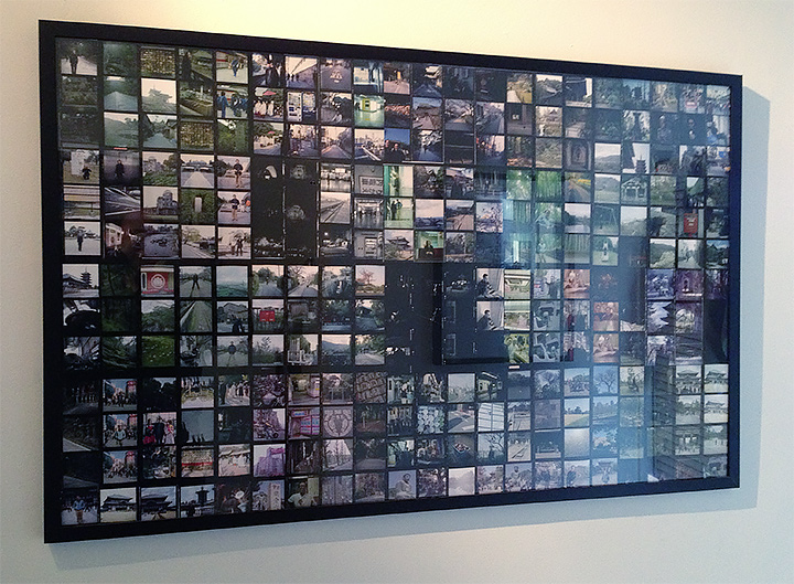
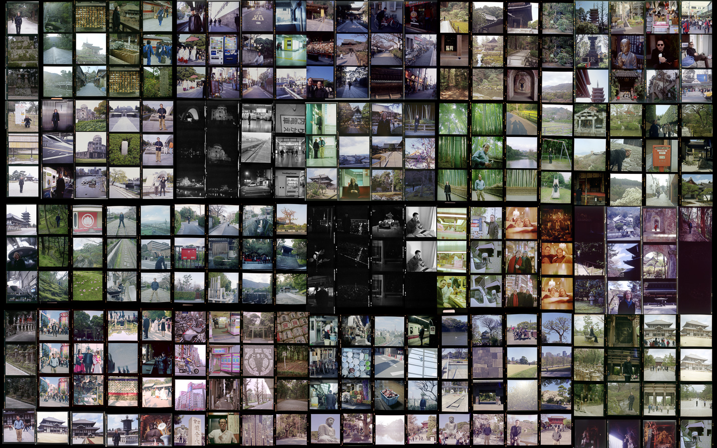
A few years ago, my partner and I went to Japan for a couple of weeks. I shot about 20 rolls of film on my Hasselblad 501cm over the course of the trip which meant I came home with about 250 images. Not a lot for most photographers over days, but in my opinion, just enough.
When I got back I scanned and printed the best of the images and had a little show at a cafe near my house. Most of those prints have been given away to family and friends (my sister for one has a number of them including a shot of fish heads from Tsukiji market in her office at the Smithsonian) but I had been meaning to do something different for a while now. I wanted to create a contact sheet of all of the pictures, have it printed as a poster, and then stick it on the wall for people to peruse when they come to visit.
Today my 30×48″ print arrived from El-Co Color (Love those guys) and it’s on the wall. Pretty neat in my opinion and definitely something different from the handful of small or medium size prints most people would create. Next I’ve got to try it with my Italy pictures.
Red River Paper – San Gabriel Semigloss Fiber Review
 If you read this site or listen to the On Taking Pictures podcast, you’ll know that I’m a big proponent of printing your photographs. I try to print out a master set of prints for each of my projects. It is expensive to do this and you need some storage space, but it is worth it. There’s something about viewing an image as a physical object which is entirely differentfrom seeing it backlit on a screen. For one, your perception of the print differs just by looking at it without all the light noise of your monitor (or iphone or ipad). Not to mention that the print will still be there when your power goes out for a week during a hurricane (as long as your house didn’t flood). You may also remember that I’m a big fan of Red River Paper. I’ve been using their paper for years now, long before we had them as a friend of the show. In fact, the only paper on my shelf is from their shop. They make excellent products at great prices.
Recently, they released a new paper called San Gabriel Semigloss Fiber. Just from the name I knew it would be interesting, because fiber papers were always under the purview of the darkroom. Traditional fiber paper is an old technology. Basically, a heavy paper with a natural mineral coating (as opposed to a plastic one), though it tends to be little harder to work with. It’s more fragile and picks up dirt easily. It also tends to curl like the dickens when wet. However, it is very archival. High-end darkroom prints, especially black and white, are typically made on fiber-based papers. I typically use more heavily-coated luster papers because I like the saturation of colors and the depth of the blacks that normal matte papers can’t match, but those coated papers don’t ‘feel’ like a traditional darkroom print.
So when I saw that RR announced this San Gabriel stuff, I wrote our friend Drew and asked him to send me a small box to try out. He kindly agreed, and after much anticipation, my paper finally arrived in storm-tossed NYC a couple of days ago.
It’s a thick and somewhat heavy paper, acid-free with no optical brighteners and coated with bartya; just like the old school papers were. It basically looks like a dark room paper without the photosensitive coating, which is just delightful.
Since I’m most interested in using the paper for B&W printing, I pulled out a photograph I took a couple of years ago of the ancient bristle cone pines in the Methuselah Grove (Inyo National Forest, CA).
It’s a scraggly bit of tree in a pile of the rocky stuff they call soil out there. Huge tonal range and perfect for testing purposes. Printed on a sheet of 11×14 from my Epson R3000 printer with no profile (Printer Managed Colors) and the results were amazing. This is the B&W paper I’ve been searching for. Looks just like prints I’ve made in a traditional darkroom.
Here’s a straight macro shot of the printed surface so you can how the ink falls on it. I will say that you can see none of the dots and mottling with your naked eye.

And here’s an edge on macro shot to show the texture of the paper. I’m focused on the tip of the corner of the image.

Finally, a backlit shot to show reflectivity. As you can see it has a little glare, but that’s because it’s coated and not a raw paper. I will say that in person the quality of reflection is really nice and organic if that makes any sense at all. Sort of a waxy sheen.

I’m going to do some more tests, but so far this looks to be my new fine art paper of choice. Well done guys. Be sure to go over to RedRiverPaper.com and get a sample pack or a box to try out. Use the coupon code OTP and you’ll get 10% off your order.
Everett and Ralph on Provia
During two of my One Shot sessions last week I also took a frame of Fuji Provia slide film. I don’t shoot regular film in the 4×5 very much because it involves going into Chelsea to get processed and then picked up and the scanned, etc. But I wanted to remind myself of the quality. The answer is that the quality is stunning, if your technique is perfect. Also below is a little phone snapshot of a 13×19″ print of Everett (Looks dark in the picture, but it’s just because my desk is not well lit). And I can tell you that the results look pretty amazing. That much better than if I had taken the shot with my 5D3? I’m not sure. Maybe I’ll do a little test at some point.


Printer Paper Decisions
 Few people actually print their pictures anymore. Personally I find that a sad state of affairs. A couple years ago I was sharing a new project of mine with one of the top portrait photographers in the game and he asked if I had printed them yet. I told him I hadn’t and he reprimanded me pretty swiftly. He said, “Print out a master set. Sign them, date them, put them in a box and put it on your shelf. Those are now the project.”
And he was right, you know. I came home and over the next couple of days I made an 11×14″ print of each of the images and they sit in a box on my shelf as we speak. They’re a physical product of the hundreds of hours of work I put into them. They’re the end result.
Printing at home can be a lot of fun too, but there are numerous decisions along the line which can effect the final product. For the sake of this essay I’m assuming you’ve got yourself access to a nice pigment ink printer so that your prints will have a longevity measured in decades or centuries as opposed to weeks and months. I’m currently using an Epson R3000. It goes up to 13″ wide which is plenty for me and uses larger ink cartridges than the R2880.
The biggest question is what paper you’re going to use. Here are my thoughts.
SURFACES
Glossy
Glossy paper is very modern and in many ways best represents the true photograph. It’s got deep blacks ( and fully saturated colors. The problem is that it’s quite reflective and can sometimes be like looking at an iPad on the beach. I personally don’t use it much. Too shiny for my taste and somehow doesn’t have any character. It’s too clean.
Semi-Gloss
Also known as satin, pearl or luster; semi-gloss papers are coated like glossy papers are, but the surface isn’t smooth. Instead then typically have a textured, almost sandblasted finish which reduces the biggest problems of glossy. Imagine your average textured photo print from the 1970’s. That probably had a satin finish. This is my preferred paper, not only does it have a D-max almost as high as glossy so that blacks and colors pop, the finish also drastically lessens the reflective problem. Best of both worlds.
Matte
Matte papers are uncoated with a smooth finish. Think of them as a think piece of regular paper. A lot of people including my friend Jeffery love matte papers when printing black&white pictures. He says is reminds him of uncoated fiber papers from his darkroom days. I can see that, but when I print the same image on matte and satin and put the two next to each other, I almost always choose the satin. Blacks and color saturation on the uncoated papers are just to subdued to me. It’s like someone turned down the vibrance and pulled up the black level to 25.
‘Fine-Art’
I’ll admit, I don’t get so-called ‘fine-art’ papers. Typically they’re a more more rough, made from cotton rag, and often slightly tinted matte paper with more natural textures. I don’t like the idea that my paper is purposefully changing the image I’m printing on it. If I wanted texture I’ll do it in photoshop. Perhaps the argument is that buyers look at ‘fine-art’ paper and it looks more hand made or unique and therefore worth more money. I’m not sure, but it always looks hokey to me. Like it’s trying too hard.
WEIGHT
A paper’s weight typically denotes it’s thickness and in America is expressed in pounds. For example 68lb stock. Interestingly enough, this is derived from the weight of a ream (500 sheets) of uncut stock used during the manufacturing process.
How thick you like your paper is subjective, but I tend towards the middle. Too light and they’re easy to bend and crease, too tight and they’re hard to roll for shipment and flatten out afterwords. Medium thickness also works well in portfolio pages or stacks of prints for people to flip through.
LONGEVITY
Over the years, people have looked for ways to make paper a brighter color of white. So ‘white’ that they often have a blue tint to them. They do this by adding optical brighteners to the papers. It’s the same stuff they put in laundry detergents to make your clothes colors pop. For longevity sake you should try to use the less brightened paper as a general rule of thumb.
You should also look for acid-free papers if you’re anal about how long your images will be around. This usually limits you to matte and fine-art stock. A good matte paper and pigment inks and your prints will out last you by a long margin.
RECOMENDATIONS
Personally, 90% of the time I print with Red River Ultra Pro Satin. It’s got a great surface and D-max without the too many brighteners which make my eyes hurt. This is what I use to print images I sell. When I do print matte I go for their Polar Matte.
In the spirit of full disclosure, Red River Paper is a sponsor of the On Taking Pictures podcast but I’ve been using their products for years before any of that happened. They sell great paper and great prices. In fact, go to http://redriverpaper.com/otp and you’ll get a great deal on a sample pack and 10% off when you decide to order.
Now go take some images and make some prints that you can pass down to your children’s children.
Print of the Day
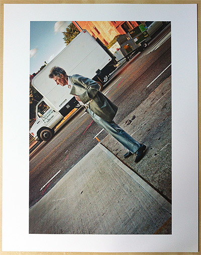
 Experiment time!
I’m in a printing frenzy today while updating my portfolio, so I thought I’d do a little special print sale of a street photograph I took last summer. Not the kind of thing I’m typically known for, but geometric, interesting and a little abstract. It was one of my favorites of the year despite the fact that I don’t like shooting street photography.
So I’m going to put up only five 11×14″ signed prints for sale for the low-low price of $50 plus shipping.
If you’ve ever wanted a print of my work for your wall. Now’s your chance. Get ’em while they’re hot!
If you want more, there’s always http://www.wadmaneditions.com/