1890’s Sideshow Pitch Behind-The-Scenes
I spent a couple of hours last night editing down the footage Claude shot at my 1890’s shoot from a few weeks ago. Not too much How-To, but you might pick up a nugget here and there. Enjoy.
Bill Wadman BTS – Sideshow TV Pitch from Bill Wadman on Vimeo.
Tag Team Backup – Digital Photography Workflow
Years ago I wrote a post on my file workflow. That is, what I do with my files once I pull them off the card to make sure that they don’t disappear. Since then I’ve made some changes to my workflow so I thought I’d write a little update to that old post.
One of the major problems with modern digital photography is that we tend to take a lot of pictures and need somewhere to put them. Strangely enough, I don’t shoot that much in comparison to most photographers, even many amateurs. For instance, my typical editorial shoot is 150 images on average. I have some event shooting friends who take more pictures in a day than I shoot in a month. So all together once I do all the math, almost everything I’ve ever shot can fit on a little over 3TB. Nothing for most photographers, I know. I still need to work on those files and backup my data however, so here’s what I’ve come up with that works for me.
The Jump to a RAID Array
I found myself waiting for 2GB heavily layered PSD files to be read and written to disk and so started looking for ways to speed up the process. The thing is that I’m a real stickler for noise and so moving to 7200RPM drives, which I find much more noticeable, was a no go. I’m also not made of money so the idea of swapping out all of my photo drives for SSD is not yet a reasonable solution (though it may be soon, more on that below). So the answer I came up with was to bond two of my WD 2TB Green drives together in an OS X software RAID-0. This doubled my throughput to around 180MB/s which is pretty good. Reducing my save/load times by almost half. Of course the big problem with RAID-0 is that if either of those drives died, all of the data on both drives dies. So when you play with RAID-0 make sure you have an extra special backup strategy in place.
Off Site First
 The most important part of backup is to get data off site. So if your house burns down or gets pulled down a river, you’ve still got your data. Now for me with a 5Mbps upstream connection, having a true one to one backup of my data drives up on the cloud just isn’t a reasonable thing to do, it would take months and months to upload. And honestly, if my house burns down, do I really need the RAW files for outtakes that didn’t make the cut in the first place?
So a while back I instituted a system of exporting my final images as full-res jpegs at 85/100 quality and uploading them to Dropbox. This both gets them out of the house AND allows me to access final print-ready copies of my work when I’m out and about or on vacation. I can send email links to any of the files right from my phone. So it’s convenience AND backup for which I pay $100/year.
Plus, instead of 3.2TB of data, my entire ‘Finished Images’ folder, everything I’ve ever shot that I care to keep, totals a whopping 20.5GB I could keep a copy local on my phone if I really wanted to. Or on a keychain USB drive I guess, that’s not a bad idea actually…
Tag Team Backup
The proliferation of inexpensive USB 3.0 drives has been a great boon to backup users everywhere. For one thing they’re cheap. Often cheaper than the bare drive that’s enclosed within goes for, and they’re seemingly always on sale somewhere. I’ve bought two 4TB Seagate drives in the past few months for about $150 each. That’s just nuts. Here’s one on Amazon right now for instance:
Seagate Backup Plus 4 TB USB 3.0 Desktop External Hard Drive on Amazon.com
The trick to my backup solution is to have two drives to backup to, but only backup to one of them at a time. One drive is on my desktop, the other is in my closet. Once a month (I switch them when I write my rent check) I swap the two drives so that the one in the closet becomes the one on my desk and vice versa. You may ask ‘Why?’, but I assure you there is a good reason for this.
Once you have a backup system working, the nightmare scenario is that data on your main library drive becomes corrupt or something gets accidentally deleted and an automated backup goes and clones those mistakes to your backup drive before you realize it. So now you’re left with not one but two drives which don’t have your data on them. By having two backups that you swap in an out, you always have a backup that’s not going to be automatically overwritten which is no greater than a month old (or a week old if you swapped them weekly, or a day old if you swapped them daily, etc). Another ancillary benefit is that the drive in your closet is not connected to power, so that if that random power surge or lightning strike kills your electronics, your data is covered.
Image Library on SDD
I mentioned above that the idea of putting all of my images on fast SSDs had occurred to me. The prices of the drives has fallen A LOT in the past year or so. To the point where you can currently buy a 960GB drive for $500. Still a little too rich for my blood, but if I archived the old stuff to a couple of external drives and kept my library tidy, I could probably get it to fit within 2TB or so. And that would only cost about a grand. A lot of money? Sure, but not completely astronomical like it would have been a couple of years ago.
It’s certainly to the point that the next time I build myself a new computer, I’ll probably make the switch. Hopefully by then the price will be down to $250/TB. Imagine two or three of those drives as your RAID-0 array. Loading images at 1.6GB/s would be pretty nice. Necessary? Nah. But pretty nice.
Family Photo Restoration
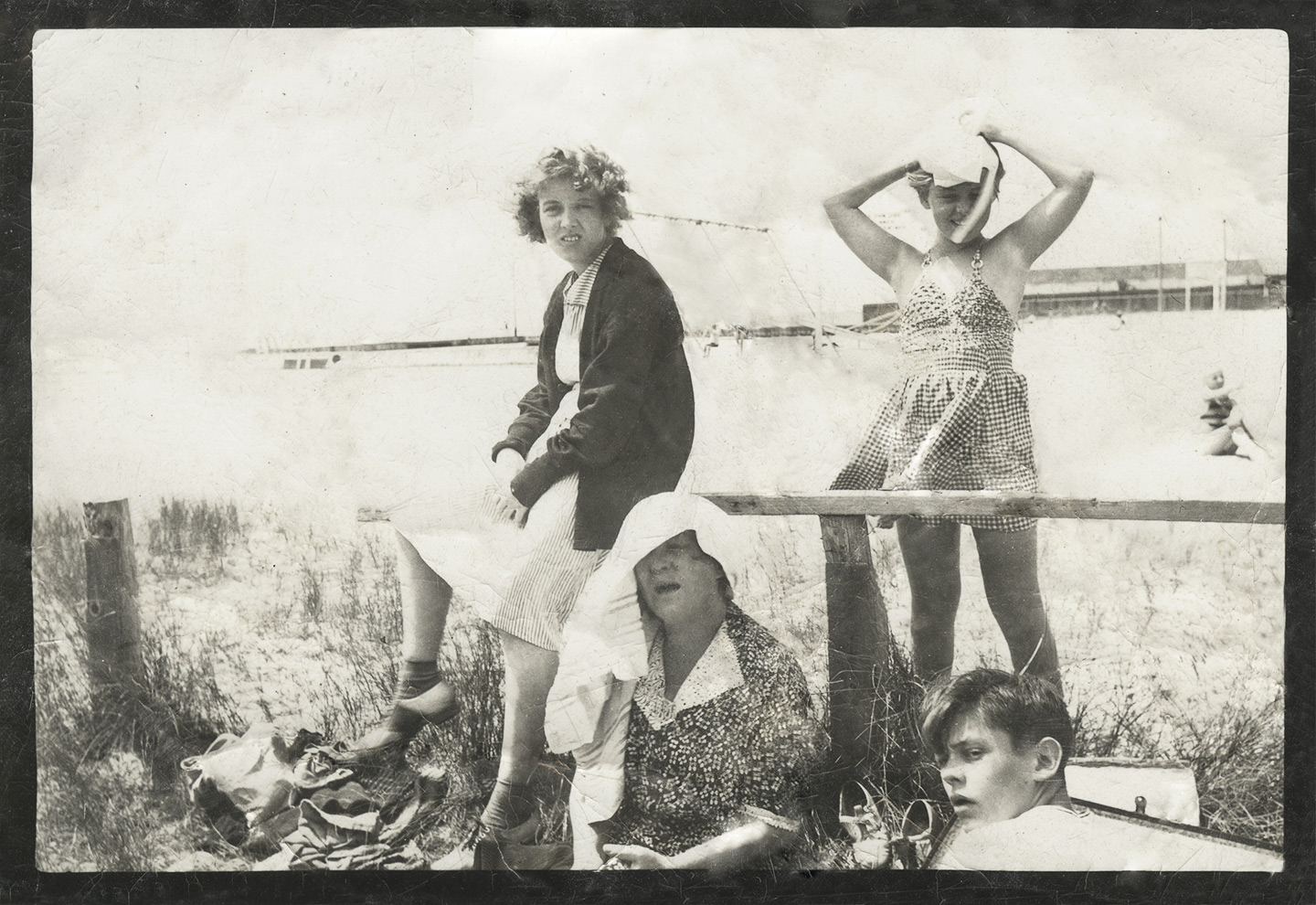
My partner brought a little present home for me from her mother’s house. Less a present really, more of an assignment. Her mother had found this picture of HER mother and sister and grandmother in some drawer or other. It had been battered and beaten and probably put through the wash a few times, but they wanted to see what I could do with it.
Step one was to scan it in order to get as much information as possible out of the original. Pulled my old Epson flatbed out of the closet and plugged it in, fired right up. Scanned it to a TIFF file at 1200dpi. Not that there was anything near that much information in the print, but I find that when doing restorations like this, the higher resolution let’s you more easily discern between the image and any physical flaws that have befallen the print. If you don’t have a scanner, you can also take a well exposed picture with your camera and start with that. Just make sure you light it from the side so you don’t get reflections in the image.
Most of this kind of work can be done in Photoshop using things like the spot-healing brush and stamp tools. Certainly when it comes to creases across a largely white sky those techniques work pretty flawlessly. The problems come when you need to invent information. The places on the print where the image has been torn away for example, that’s information I have no way of getting back. For things like the pattern in their dresses, you can use the healing tools to mimic or clone in the pattern from elsewhere to good effect. Other areas like the swing set to the right of the central girl, I can’t accurately recreate that. Best I can do, within reason, is to use the surrounding image to guess, and that’s just what I did.
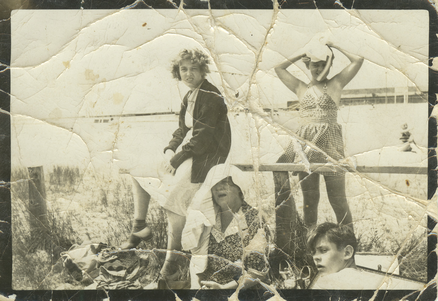
Overall not bad considering I only spent an hour or so on it. Is there room for more work? Sure, but you’re quickly approaching the limits of your return on time invested. We want to save and perhaps restore the memory a bit, no need to go all Ken Burns.
I also could have increased the contrast even more and desaturated the whole thing entirely. That would probably deliver an image that was much closer to how the print looked in the 1930’s, but also kind of loses some of the Age that the print has imbued on the memory. So in the end I pulled back the contrast and desaturation layers to let it feel a bit more like the original.
Either way it’s a good ‘waiting for the snowstorm’ project, and a great way to get your feet wet in PhotoShop. You’ll learn how to use layers and healing/clone tools, as well as adjustment layers and color. I highly recommend you get a tablet to do work like this. Trying to do this with just a mouse would be like doing a fine pencil drawing while wearing ski gloves. The less expensive Wacom tablets are a great deal, and a good place to dip your toe in the water.
So go rummage through some drawers and give it a shot. Your children and your children’s children will thank you some day.
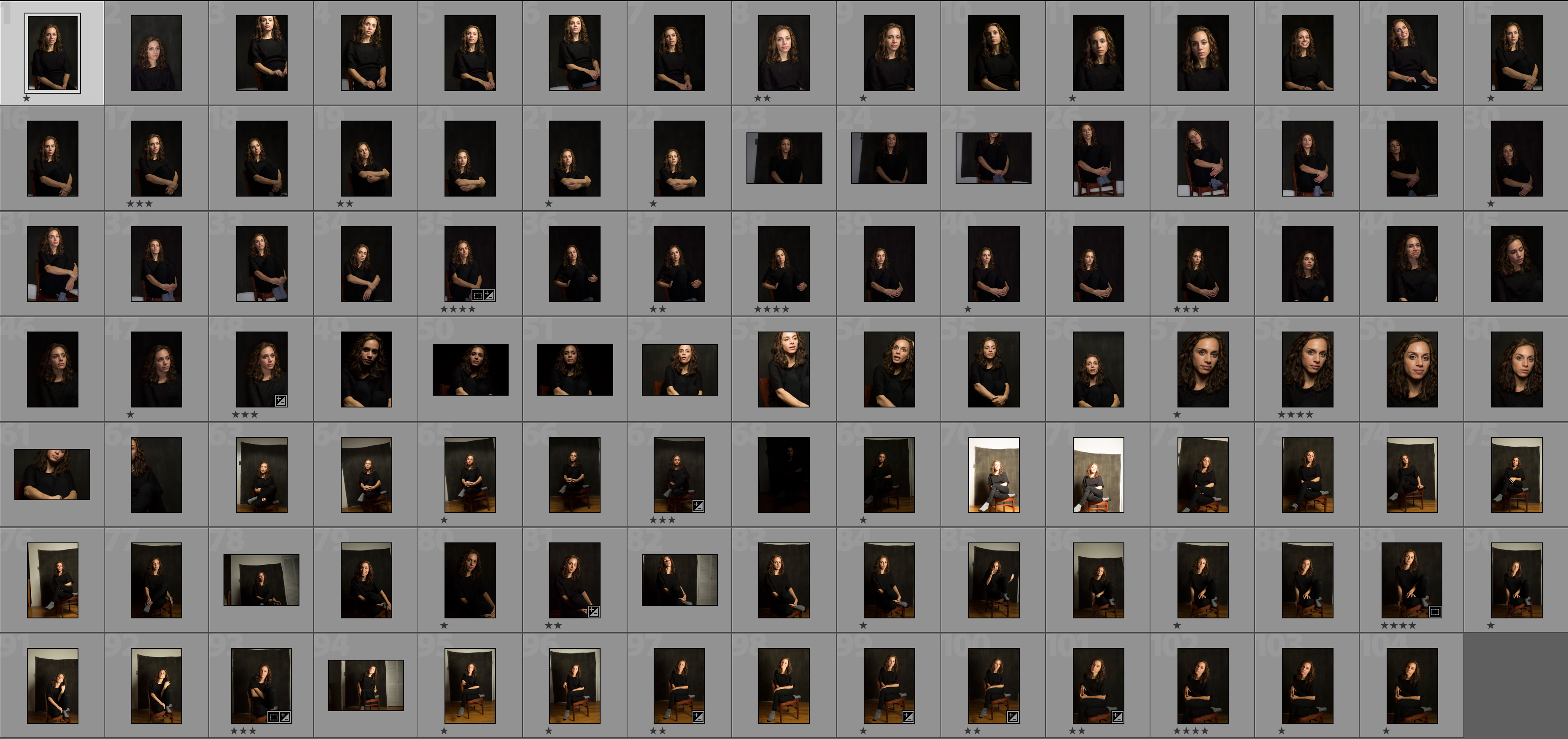
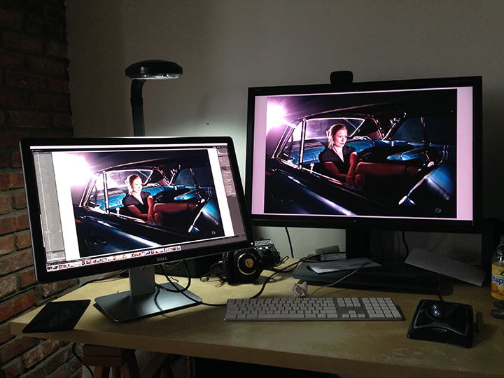
Contact Sheet of a Typical Shoot
Someone recently asked me if I’d consider sharing a contact sheet of one of my shoots, so they could get a sense of the scope of a shoot and my editing process and such. So here you go, a GIANT 3700 pixel wide screenshot (4k monitor baby!). It shows a total of 104 images, I deleted a couple of black frames where the flashes didn’t fire, but the rest are in there once we got started. I should say that this isn’t a ‘typical’ shoot in any normal sense. My friend Caroline was in town and came over for a chat, and since she’s quite the photogenic one, I took the opportunity to shoot some portraits while we were catching up. I’ll post the final selects in a bit. In the meantime, enjoy. I highly suggest that you right-click and ‘save linked file as’ the linked image to your desktop to view it as big as possible.
Hackintosh and a 4K Monitor
I had been limping along with a 5 year old NEC 3090 as it started to fail over the past few months, but didn’t want to replace it with another low DPI screen when I knew the 4k stuff was coming right around the corner. Then a few weeks ago Dell announced a 24″ UltraHD (3840 x 2160 pixels) display in their UltraSharp PremierColor series, the so-called 2414Q. I watched and waited for it to be available on Dell.com. Every morning waiting for the button to go from “Contact Dell” to “Buy Now” and it finally did a couple of weeks ago. After some delays in shipment my screen finally arrived this morning and I thought I’d write a little post on my experiences. This will be updated as I fiddle some more, so be patient.
First Encounter
I plugged the screen into my very fast i7 Ivy Bridge Hackintosh with a GTX 760 GPU and I got full resolution on the first try. The problem is that it’s stuck at 30Hz refresh rate. Now the GPU has Displayport 1.2 and in Windows 8.1 people have been running similar screens at 60Hz. Apparently the Nvidia driver built into Mavericks (there is no Nvidia web driver for Mavericks yet, or ever) does not support what’s called MST or Multi-Stream Transport. Basically the way screens these hi-res screens work is that you send two screens worth of data (that’s the Multi-Stream part) over the same cable and the screen just displays them next to each other on the same panel. No MST in the driver means I’m stuck at 30Hz. I’ve heard that the latest Nvidia Web Drivers for Mountain Lion has MST support, so I’m currently cloning my last 10.8 installation over onto an extra drive to see if I can get it working over there. Sometimes when you’re on the bleeding edge, you get cut.
The other issue I’m having is that the built-in resolution scaling is not working. So my screen is actually running at the full 3840×2160, which on a 24″ monitor is pretty tiny. Not completely unusable for messing about testing, but not the kind of thing you’d want to stare at all day long. So once I get the refresh rate problem nicked, I’ll figure out how to get it to show screen real estate something closer to 2560×1440 only with a whole lot more pixels to smooth things out.
That said, my initial playing around with images in Lightroom has made me feel similar to how I felt when I first upgraded to a color calibrated screen. All the little flaws in sharpness that you really didn’t notice before because you were going between a low-res overview and 100% are now glaringly obvious, much like they are when you look at a print. It’s pretty amazing. 180ppi on a desktop screen. Yum.
Round Two
My next move was to install 10.8.5 on an extra drive to see if the passing comment I read on an online forum was true. The idea was that the web drivers that Nvidia themselves released for Mountain Lion allowed for the illusive MST mode. No dice. Unfortunately I had the same results as in Mavericks. Looks like I may have to want for a driver update or some coding genius to come along and help me out.
HiDPI Mode (Kinda!)
Ok, so I’ve made some progress. I’ve got the screen running like a pixel doubled 1080p screen. So it’s showing the screen real estate of 1920×1080 while being really really smooth and sharp. To do this I had to enable HiDPI mode in Mavericks using this terminal command:
sudo defaults write /Library/Preferences/com.apple.windowserver.plist DisplayResolutionEnabled -bool true
Once I did that, 1920×1080 (HiDPI) showed up under the ‘Scaled’ section in the display preferences. The problem was that every time I tried enable it, the system would automatically select a refresh rate of 30.3Hz which made the Dell monitor just barf and show me a black screen. To get past this hurdle I switched back to ‘Best for Display’ and then selected ‘Scaled’ again while holding down the Option key. That allowed me to choose 30Hz AND 1920×1080 (HiDPI), and Voila! Retina style beauty. The next step is for it to give me a little bit more room to breathe. What I’d love is the real estate of 2560×1440 while using the pixels to smooth things out.
I still have the problem of 30Hz vs 60Hz refresh rate, but that may have to wait for a driver update that may or may not come. That said, we’re back in the “Ok, I’m going to keep this thing” camp. I don’t think it’s going back. Also apparently there is a bug in Chrome that makes it completely slow on HiDPI external monitors. So I’m temporarily using Safari for the time being.
More to come as I continue my troubleshooting…
It’s Not The Umbrella’s Fault – Einstein / Speedlight Modifier Shoot-off
I mentioned last week on the show how I felt like a speedlight and an Alien Bee looked very different through the same umbrella at the same subject. So I thought I would put it to the test.
Conrad sat in for me while I shot her from approximately two feet with:
A Paul Buff Einstein w/
– 7″ reflector
– 32″ shoot-through umbrella
– 32″ silver umbrella
– 22″ beauty dish
– 22″ beauty dish with 30 degree grid
– 22″ beauty dish with sock
– 24×36″ softbox
– 24×36″ softbox with grid
A Lumopro 120 Speedlight w/
– bare
– 32″ shoot-through umbrella
– 32″ silver umbrella
– 16″ softbox
The images were color corrected in Lightroom using the color chart on the wall.
And you know what? At least for the soft sources, they all don’t look THAT different from one another. So maybe I’m wrong. What do you think?
UPDATE:
So I’ve taken a look at them after a short night’s sleep and I wanted to point out a few things. While the light from the umbrellas and softboxes and such look pretty similar from a couple of feet away, you will notice that there is a huge difference in their spill into the rest of the scene. So if you need control over your lighting, some options are definitely better than others.
Also even though I was using strobes that ‘should’ more or less be about daylight balanced, there was a wide variation of white balance settings in post to get them in line with each other. The light from the Einstein for instance had color temp of 6000º, 5950º, 5250º, 5100º, 5500º, and 5000º depending on the modifier being used. The speedlight was even worse, 6600º, 6900º, 7500º. Remember that next time you use a strobe and think you can just set your WB to Daylight or Flash and call it a day. Nope. When in doubt, shoot a grey card at the beginning of your session so that you have a reference in post.
For me, it comes down to convenience to a large extent. If I have to carry my gear to a shoot I want to get the most bang I can get for the size/weight buck. For me lately that has been a couple of 36″ Softlighters from Photek. They fit criss-cross in my Pelican rolling case and can be used as white umbrellas, shoot-through umbrellas, and as designed with the front diffuser. Three tools in one. (Plus they’re cheap!) That said, yesterday I was shooting some corporate headshots and brought along an Alien Bee with a 46″ Softlighter and the light from that much larger source (remember, the area of a circle is π times the radius squared so it’s about 50% more area than the 36″) was lovely. Wrapped around so nice that I didn’t even need a reflector.
In the end though, soft light is soft light. How you make it and how ‘soft’ it is largely academic. If what you’ve got is an umbrella, it’ll be fine. If you’ve got a softbox, use the softbox. Stop worrying about the 5% difference in the quality of light and start worrying about making better photographs. Let me put is this way to wrap up: If you’re pictures aren’t good enough, it’s not the umbrella’s fault.


Pipes Result – Monster
On Saturday I wrote a post about my ideas for using a couple of giant pipe segments in a conceptual photo. I ended up having a couple of lovely friends Francisco Graciano and Eran Bugge come over and play the roles of savior and damsel. Here is the result (Click to enlarge):
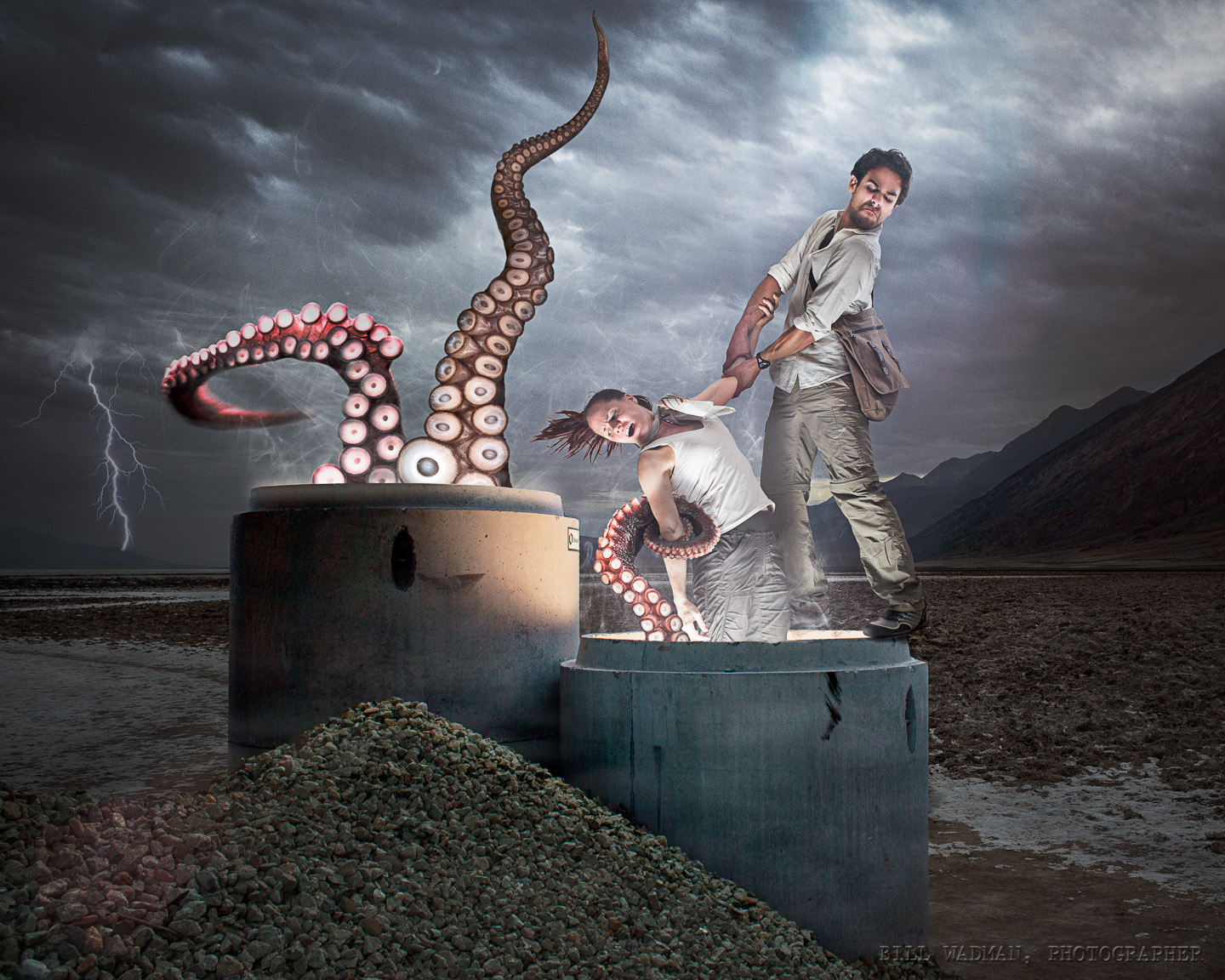
As you can see it ended up a bit differently than I had originally planned (as things like this usually do). First, I gave up on the caving idea, no exciting enough, plus I couldn’t get my hands on the equipment I’d need to make it believable anyhow. That’s when I came up with the idea of them running from the imagined jaws of a cthulhu-like monster from beneath the ground.
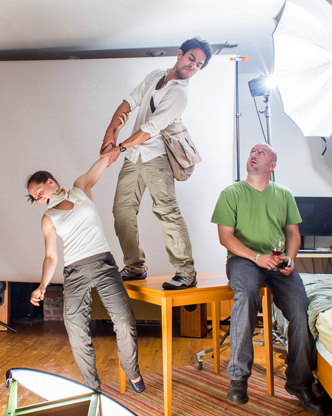 The first thing I had to do was move the pipes and gravel pile to a more desolate location, so I co-opted a landscape I took on the salt flats at the bottom of Death Valley at dawn. Much better. Cisco and Eran showed up and we shot about 30 pictures of them if various forms of the pose with Cisco standing on the edge of a table (with my friend Guillaume serving as a counterweight. As you can see I had a soft light from below blasting them to match the light from the pipe, plus one behind to rim light Cisco a little bit. There was also another strobe next to the camera bouncing off the wall to give some overall illumination to the shadows that the other two lights caused.
Compositing the two together was the hard part, along with the random science photos of tentacles. That stuff took a couple of hours. Cleaning up the masks on each element, playing with curves to try to get the contrast and brightness to match between layers.
I posted a version on facebook and G+ last night at around this point. I knew normally I’d spend another hour or two playing with it to really polish things up, but I was tired so I went to sleep. This morning however I added the final touches. Smoke coming up from the pipes, a minor lens flare or two, a lightning bolt, plus a whole lot more 1 or 2 pixel clean-ups.
Is the end result believable? Well it is a giant underground octopus attacking my friends in the middle of Death Valley so let’s be reasonable about the answer to that question. That said, I think it’s successful and silly, and a lot of fun. It ended up very different than I originally intended, but also much better. Not bad for a weekend project.
Scanning Film with a Camera – My Test
So I was doing a little research about film scanners today and came to realize that most of what’s left in the market are either way too cheap and low-res (basically to preserve family photos) or too expensive and from companies I can’t trust will be around in 6 months. I’ve been unsatisfied with scanning on my Epson 4990. It’s fine for large format and even 6×6, but for 35mm I’m never happy with the results. I’ve tried using the film holders and end up with soft images; I’ve tried laying the film on the glass and then have to fight Newton’s Rings.
I remember a few months ago I read a post somewhere about using your dSLR and a macro lens to shoot slides and thought about trying it with negatives as well. In the end I found this post on petapixel which was very helpful. I didn’t have a light table handy, but I had a little battery powered LED light which I diffused through a stack of tissue paper, set the camera up on a tripod with a 100mm macro lens and pointed it straight down toward the film The results are very impressive. Now these are not the sharpest film shots ever, but they give you some idea of the quality you can get out. MUCH better than I’ve ever gotten from my flatbed and using gear I’ve already got.
I tried some color film as well with less than ideal results. The color temp and spectrum of the LED just wasn’t up to the task. Color negative film is REALLY hard to get the color right when scanning, in my opinion. The only time I’ve ever gotten great results was when I rented time on an Imacon with custom profiles for each film type.
TIP: Use live view and 10x magnification to get the focus right. Also stop down on the lens a bit to get to the sweet spot and handle any slight depth of field softness.
Here’s a 100% blow-up of the above:
Pelican 1510 Camera Case
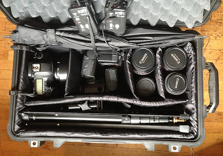
So I gave in an bought myself a Pelican model 1510 rolling case for my camera and such. Everything I’d need for a typical editorial portrait shoot. Packed in there I’ve got:
Canon 5D Mark III Body
28mm/1.8
35mm/1.4L
40mm/2.8
50mm/1.2L
50mm/1.4
85mm/1.2L
Canon 580 EX Speedlight
Nikon SB-80 Speedlight
2 Pocketwizards
2 Manfroto 6′ mini light stands
and I think I can fit two 36″ Softlighters diagonally across the top before I close it, or at least the umbrella parts. This is my first attempt, I’ll get more refined in time. I won’t need to carry all those lenses all the time of course. I just wanted to see how much I could fit.
It’s not light though. Weighs in at just over 30lbs all in. Not bad considering the shear number of options it gives me and it’s very compact size. Let’s just say that I’m glad it’s got wheels.
Speaking of wheels, I’m considering replacing them with softer/quieter rollerblade wheels like this guy did:
UPDATE: I did in fact find replacement wheels on eBay. Here’s a link for as long as it exists. Just look up 60mm x 20mm luggage wheels. I got mine from a place in Hong Kong. $15-20 with shipping and they installed fine and are much quieter.
If you’re going to buy one, do so from this amazon link and I’ll get a few cents to support the site:
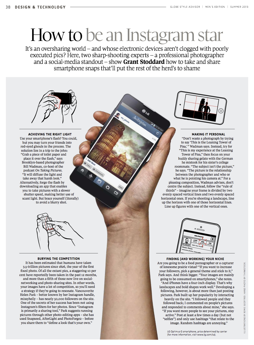
Advice in Globe & Mail
My good friend Grant Stoddard interviewed Helen Park and myself for an article in the Canadian newspaper of record The Globe and Mail. Check out some of my advice. Apparently the good stuff where I point out that “YOU are not Kubrick” was cut. Too controversial perhaps.